
ADIDAS X REFINERY 29

ADIDAS X JUSTBREE X REFINERY 29

#greatereveryrun when we are #rooted.
My overall theme for this project stemmed from my current home for the last 6 years: the island of Oahu, in Hawaii. My love for this island grew over time as my creativity and inspiration grew as an individual. There were many times while living here I wished I could just fly home and have my family take care of me, but that can be difficult when you have a whole ocean between you and the rest of America. So I grew as an individual and found my footing in art.
I designed each shoe from the ground up. I like to paint from the sky down in my resin art and I am mostly inspired by aerial photography. So this was very interesting to design from the ground to the sky.
I became a yoga teacher at the age of 16 and fell in love with yoga after my ice skating career came to a stop at the age of 12. One thing we teach in yoga is being grounded where your feet are balanced. I put myself in the ultraboosts to get a feel for them and to allow myself feel every emotion a woman wants to feel when she wears a shoe. At first I felt strong and stable. The width of the base of the shoe was so wide and comforting. I felt like I could stay balanced and strong in the shoes while wearing them. I wore the shoes while painting with resin, walking to a yoga class, running in my hometown of Dana Point, California. Each shoe represents a portion of my life. I will say it was difficult designing a couple of shoes since some of the places I had never been to, but it was so fun to pull from history and my own knowledge of these beautiful states.
EARTH MEETS WATER
Rhode Island: Age 0-8

These were by far my favorite shoes to design. I even debated switching them out with my own pair because I wanted to keep them so badly. The R.I. shoe symbolized a lifeboat if you are viewing it from above. A vessel that brought a lot of us over to America from Europe. My family came over from Poland, Ireland and England to find a more prosperous life for their children. If you tilt the shoe upwards with the heel up and toe down, I see a lighthouse. The light to guide us home.
I was born in Laguna Beach but I grew up knowing my European genealogy and that knowledge will always be a gift to me.
🐾I used oxford blue paint to strike the top of the foot sock in symbolism to a white boat stricken with waves on their journey to America in the 1700-1800's. I also used that same navy blue in permanent marker to tap the bottom tab of the shoe laces to keep the laces almost completely white. This shoe is very white because for me the "color" white gives a purity. I painted the bottom layer of the sole of the shoe with a very raw grounded brown color. The soles of this shoe are the land we walk on.
Michigan: Age 8-12

I loved the colors on this shoe and I tried to keep the colors light and happy. I was inspired by ice skating on lakes. I started ice skating at the age of 8 and loved the gracefulness of it. I had to cross-train in other sports like yoga, ballet, tap dance and contemporary dance. None of those dancing forms ever compared to the beauty of dancing on the ice. I remember putting my ice skates at the bottom of the stairs every night to be able to pack up quickly, before I went to bed. I would have lessons before school at 6am (my mom driving me 40 minutes each way) so I could train with coaches that could bring me to the olympics. It was an expensive sport (like boating on lakes), and I had to be okay to let go of my dreams of being known for ice skating at the age of 12. These shoes symbolize silliness, fun/light-hearted spirits and an ode to those five years of being on "lakes of ice".
🐾 the soles of this shoe stay white like the frozen ice in the winter time of Michigan lakes. Then I used permanent marker on the wings of the shoes to create a three-patterned stripe of yellow, pink then blue. The laces have a feather-like pink and blue exposing white - lacing up our boots to weather the cold. The left shoe holds 5 cross stitching in changing colors of yellow, blue and pink. The right shoe has 3 stitchings. I hope whoever gets this pair of shoe comes up with their own meaning behind the differing of stitching on each shoe.
Washington: Age 12-18

This shoe was super fun to design, as I pulled mostly from my love for the ocean. I didn't focus on my theme of earth although I did keep the port of Seattle in mind. My biggest inspiration for this shoe stemmed from my growth in my creative processes growing up. Wes Anderson (W.A. hah get it?), surfing, painting and returning to the ocean even on gloomy days for beach walks, is what made this shoe so perfect. I pulled the water colors to bring it all together & make this shoe stand out among the rest.
🐾 I used permanent marker on the wings of the shoes and used all the same colors on the laces in that feathering effect. The sole of the shoe stays white to symbolize my pure love for the ocean and how it has always been apart of my family's history. The nautical knot is fastened with a gold ball as the anchor making this a "boat" shoe. I dreamed this shoe could help me walk on water.
The display that I created and sent to Refinery 29 was one of a couple I made. If you turn the display over to its underbelly you see my artistic waste sealed inside the color pallet for the whole project. Leaving our waste in the ocean is a sure way to start killing off something we all say instilled beauty within us. My goal as an artist is to be less wasteful and to help the environment as I try to make the world a little more beautiful with my artwork.

Hawaii: Age 18-23
Obviously this shoe was my anchor. I kept coming back to designing this shoe when I would get a creative block on the others. The bottom sole of the shoe has my name and a name I want to name our future child, and on the other shoe it has my husband's lineage and a name he wants to name our kid. Hawaii was the start for us. It is a place we hold close to our hearts. So this shoe was designed a bit more personal than the rest.
🐾 the materials used in this shoe was kept very raw and organic. Just paint and marker. I wanted this shoe to seem playful and almost childish. I wanted this shoe more than any of the other shoes to feel that clashing of earth meets water. I feel rooted here and every symbol on the pair of shoes has a story to tell. Too bad those stories would take hours maybe even days to tell.
Oregon: Age 23+
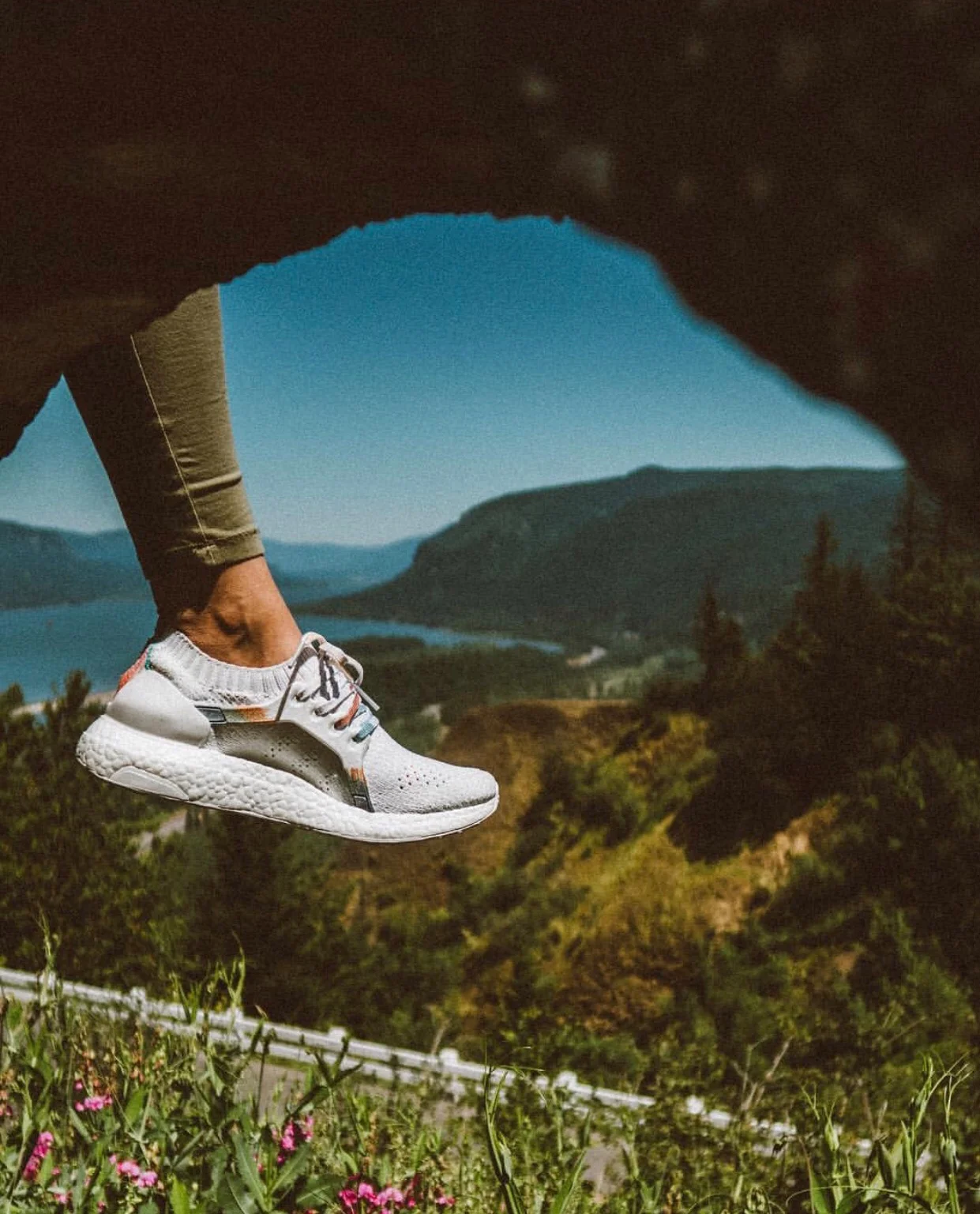
This shoe was my future. I have only been to the coast of Oregon once (according) to my mom, although I have no memory of it. So for me, this shoe is "unseen" to me. It is my balance of work and fun. A balance of hard work indoors and fun work outdoors.
🐾 this shoe was similar to Washington but it has a more native coloring. One where we feel the woods meets the ocean. I used permanent markers only to keep Oregon simple and carefree.
🌎 some shoes have rocks in them I grabbed from my favorite park in my hometown of Dana Point, California. Rocks in your shoes help you remember where you come from. The idea is that those rocks can be uncomfortable but if you can live with those rocks settling at the toe side of the shoes you can walk upright against any pain you have once experienced.